Color choice of a mat is a highly subjective aesthetic in matting design. Beyond balanced mat widths, the incorrect color choice of your top mat can distract from your art and accompanying frame design. The two guidelines I recommend are based off of color theory and intent of focus.
Color is relative. Any color will have a different appearance of vibrancy and saturation depending on the color around it. An example is the red box (RGBff3333) example below.

Note how the red square on the left seems more vibrant while the red box on the right seems to be more muted. That color relativity information can be used to your advantage in mat color choice.
This was taken into consideration by a client of ours who brought in Star Wars art painted on wood panel. Because of the warm tones, Bryan (not his real name) wanted to accent the works' warmth and elected to mat the work with a red color.
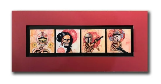
I had discussed with Bryan how black would influence the warm tones in the art and make them "pop". My initial recommendation was to just mat the work with black. The work was mounted on a black board and a red mat was placed around it. To my eye, the red mat overwhelmed the art, creating equal visual importance to the border and art.
Surrounding the work with all black placed the focus directly on the art. But our client felt it was too "gallery" like in its display and wanted more personalization and flair to the design.

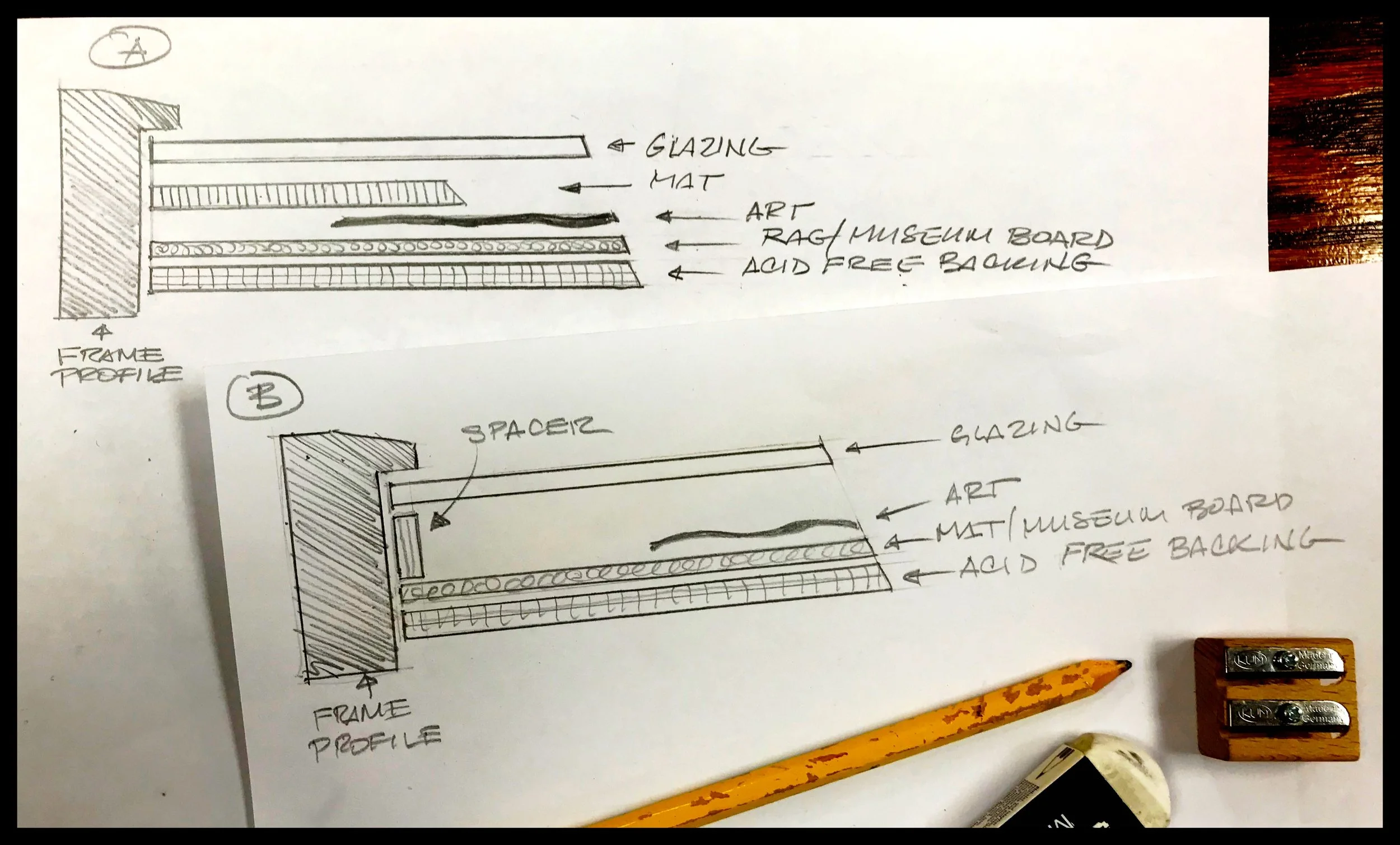
After some discussion, Bryan had settled on the idea of a red accent color, but in a way that didn't overwhelm the piece. We had come to a compromise and I recommended using either a bottom mat (below left) or a bevel accent, which is a deeper board and a wider bevel (below right).

Either mat design would have worked, but we elected to use a bevel accent to create more depth so the glazing would be further away from the art. Add to that the desire for a bolder, but not overpowering accent, the decision seemed clear. (note: bevel accents are now a discontinued item, but Atelier Rosal can hand make them with certain colors.)
The matted work with the accented mat colors was then finished off with a black frame with a distressed finish.

While we pride ourselves in our workmanship and design, our aim is for the viewer to walk away and remember the ART more than the framing. Whatever the piece you need framed, either family photos, limited edition or original art, we'll see to it that the focus is on the image that is important enough for you to frame.